Javascript SDK
The Sketch Javascript SDK makes it easy to use Sketch in your web browser. Please follow the guide.
Getting Started
Import javascript for Sketch
First, add the following tag in <head> to import Sketch into the browser.
| Version | Download |
|---|---|
| 1.0.0 | sketch-1.0.0.js (opens in a new tab) |
| 1.0.0 minified | sketch-1.0.0.min.js (opens in a new tab) |
<script type="text/javascript" src="https://media.render-it.m2s.team/sdk/web/sketch-1.0.0.js"></script>Create a DOM to load the Sketch Editor
<div id="root"></div>Add a <div> tag for Sketch Editor. Be sure to enter an id value. An example of an id value is root.
<style>
    #root {
        width: 800px;
    }
</style>
Add Sketch Editor
<script>
    document.addEventListener('DOMContentLoaded', function () {
        const root = document.querySelector('#root');

        const editor = new m2s.Sketch({
            container: root,
            apiKey: 'YOUR_API_KEY'
        });
    });
</script>
Create m2s.Sketch for Sketch Editor. See below for a detailed list of options.
Here's the code you can use.
<!DOCTYPE html>
<html lang="en">
    <head>
        <script type="text/javascript" src="https://media.render-it.m2s.team/sdk/web/sketch-1.0.0.js"></script>
    </head>
    <style>
        #root {
            width: 800px;
        }
    </style>
    <body>
        <div id="root"></div>
        <script>
            document.addEventListener('DOMContentLoaded', function () {
                const root = document.querySelector('#root');

                const editor = new m2s.Sketch({
                    container: root,
                    apiKey: 'YOUR_API_KEY'
                });
            });
        </script>
    </body>
</html>
Avatar image
You can get an image by calling getBase64Image("imageSize").
<!DOCTYPE html>
<html lang="en">
    <head>
        <script type="text/javascript" src="https://media.render-it.m2s.team/sdk/web/sketch-1.0.0.js"></script>
    </head>
    <style>
        #root {
            width: 800px;
        }
    </style>
    <body>
        <div id="root"></div>
        <button id="getImage">getImage</button>
        <div id="imageResult"></div>
        <script>
            document.addEventListener('DOMContentLoaded', function () {
                const root = document.querySelector('#root');

                const editor = new m2s.Sketch({
                    container: root,
                    apiKey: 'YOUR_API_KEY'
                });
                document.querySelector('#getImage').onclick = async () => {
                    const base64Image = await editor.getBase64Image('320px');
                    const image = new Image();
                    image.src = base64Image;
                    image.onload = () => {
                        document.querySelector('#imageResult').appendChild(image);
                    };
                };
            });
        </script>
    </body>
</html>
Use Sketch Editor


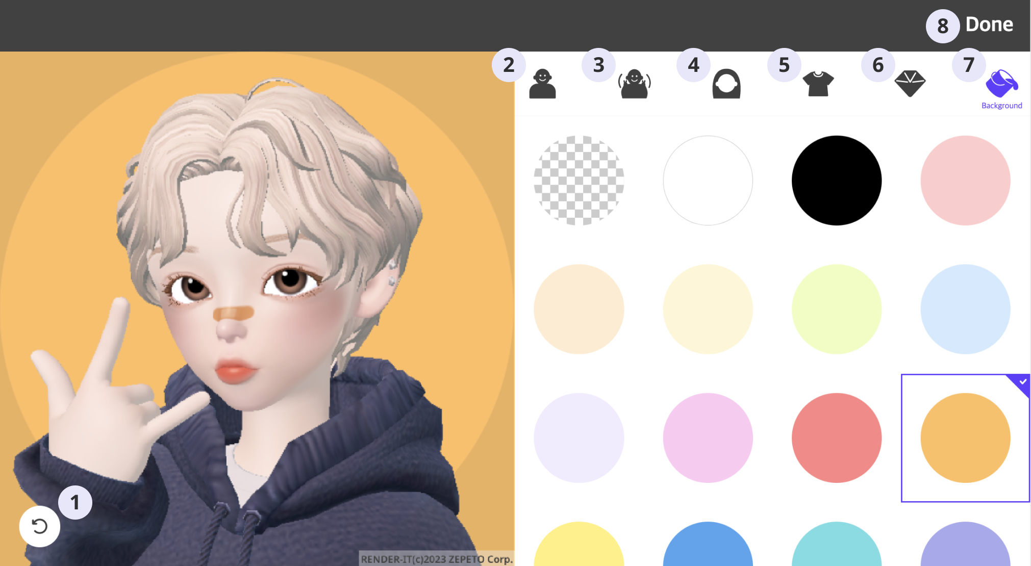
- Undo the current selection and return to the previous one.
- Change the avatar.
- Change the pose.
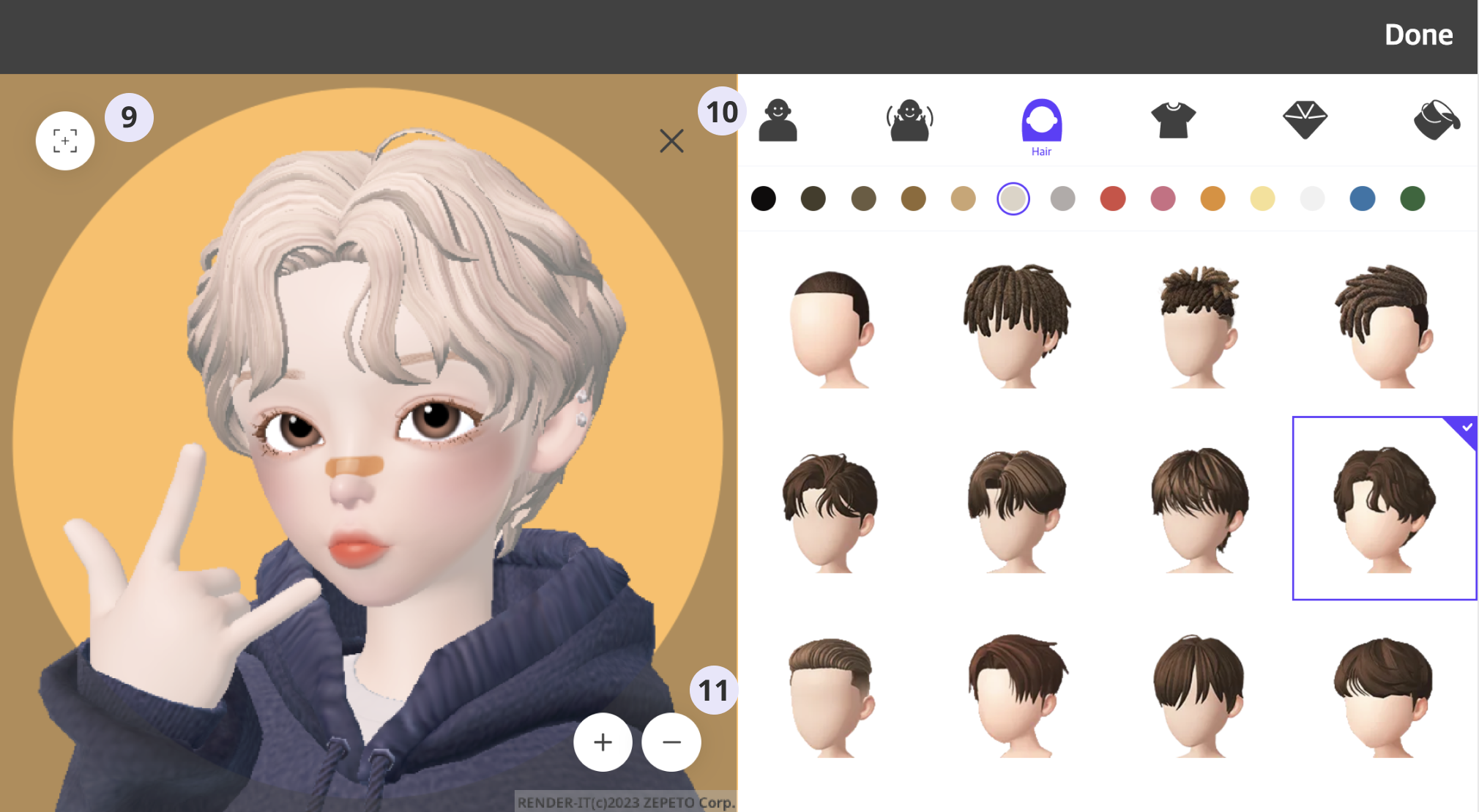
- Change the hair type.
- Change your outfit.
- Change accessories.
- Change the background color.
- Download the image as a file. You can download it by specifying the image size. (Image size selection modal pops up if multiple image sizes are specified.)
- Center the avatar image.
- Turn off crop mode.
- Resize crop area.
Sketch SDK has been prepared successfully. Preset allows you to view preview images with costumes, avatars, and poses, and Avatar Image can be downloaded by pressing Done!
Sketch options
| Option | Type | Default | Description |
|---|---|---|---|
| *container | Element | DOM container where Sketch Editor will be rendered | |
| *apiKey | string | Sketch API key | |
| imageSize | string[] | ['128px', '256px', '360px', '480px', '512px'] | Size of the output image. The quality of the original image requested by the API call for download is automatically selected by the image size and several factors. Depends on the calculated Output Size below. Output size = (Image Size * Preview Size * 1.2) / Crop Size
The value between 50px(inclusive) and 512px(inclusive) can be used. |
| previewQuality | string | Quality is determined based on the greater value of either width or height of the preview area. | P160P240P320P480P640P960P1280P1600P1920P2560P3200P3840Resolution code of preview image. Note: If not present, "previewQuality" is automatically specified based on the preview area. If the height and width of the preview are different, the larger one will be the "Preview size". This can be affected on billing. Please see the Preview Plan on Pricing. |
| inputMode | string[] | ['button', 'touch', 'mouse'] | touchmousebuttonSelect the interaction input environment in the Sketch Editor. |
| previewWidth | string | auto | Width of preview canvas. Applies only in horizontal mode. Use CSS units such as px and %. ex.) 100% or 100px Note: the preview size is set default 1:1 ratio of width to height. |
| previewHeight | string | auto | Height of preview canvas. Applies only in vertical mode. Use CSS units such as px and %. ex.) 100% or 100px Note: Note: the preview size is set default 1:1 ratio of width to height. |
| avatar | string | Avatar code for using a single avatar. Avatar categories are not exposed when set up and you cannot select another avatar. | |
| itemCategory | string[] | ['hair', 'clothestop', 'accessory'] | hairclothestopaccessoryList of item categories to be used by the Sketch Editor. |
| pose | string | Pose code for using a single pose. Pose categories are not exposed when set up and you cannot select another pose. | |
| background | string[] | ['transparent', '#FFFFFF', '#000000', '#FFCCCC', '#FFECD0', '#FFF6D6', '#EEFFBF', '#D3EAFF', '#F1ECFF', '#FFC8F3', '#FF8585', '#FFBF5F', '#FFF27C', '#51A4F0', '#73DEE4', '#A9A8ED] | Custom Preview background color. Use a fixed background when entered with a single color element in array and do not see the background selection icon in the category. When multiple color elements in array, only the list is provided as a selection option. The option must be provided as hex format or "transparent". |
| hairColor | string[] | ['#0E0C0C', '#443D2B', '#6C5B41', '#906A35', '#CCA671', '#DDD4C7', '#B1ABA9', '#D44B43', '#CE6D83', '#DF8F2E', '#F7E193', '#F1F1F1', '#3373A8', '#31673A'] | Custom Avatar hair color. Only the entered list of elements is provided as a selection option. The option must be provided as hex format. |
| theme | string | light | lightdarkTheme in Sketch Editor |
| customTheme | object | Customize Sketch with your theme. | |
| layout | string | horizontal | verticalhorizontal({width:number,height:number}) => "vertical" | "horizontal"The layout of the SDK Editor. |
| optimizeUndo | boolean | false | truefalseSelect whether to omit duplicate detachment of the same item during undo. |
| showCategoryTooltip | boolean | true | truefalseUse Category Tooltip |
| cropShape | string | full | circlesquarefullShape of crop area. |
| showToolbar | boolean | true | truefalseUse the toolbar at the top of the Sketch Editor |
| toolbarButtonClickAction | function | Download image file | (base64:string) => void | Promise<void>This is the callback function that is executed when the button on toolbar is clicked. Download the image file as the default behavior. |
| toolbarButtonText | string | Done | The text of toolbar button |
| fileName | string | Sketch | The file name downloaded when downloading a file with the default "toolbarButtonClickAction". Note: The file extension is fixed to png. |
Custom Theme options
| Option | Type | Default | Description |
|---|---|---|---|
| categoryGap | string | 20px | Minimum distance between Category Icons |
| categoryIconColor | string |
| Default color of Category Icon |
| categoryIconSelectionColor | string |
| Color displayed when the Category Icon is checked |
| categoryIconHoverColor | string |
| Color displayed when the Category Icon is in the mouse hover |
| categoryBackgroundColor | string |
| Background Color of Category |
| categoryArrowColor | string | #aeb2ba | Color of scroll arrow in Category |
| categoryBorderColor | string |
| Color of border between hair color category and item section. |
| categoryHairIcon | string | Hair Caterory icon URL | |
| categoryClothestopIcon | string | Clothestop Category icon URL | |
| categoryAccessoryIcon | string | Accessory Category icon URL | |
| categoryBackgroundIcon | string | Background Category icon URL | |
| categoryAvatarIcon | string | Avatar Category icon URL | |
| categoryPoseIcon | string | Pose Category icon URL | |
| previewButtonColor | string |
| Button Background Color in Preview |
| previewButtonInnerColor | string |
| Button icon color in Preview |
| previewCloseEditButtonColor | string | #404040 | Close Edit Mode Button icon color in Preview |
| previewCloseEditIcon | string | Preview close edit mode button icon URL | |
| previewInitpositionIcon | string | Preview position initialization button icon URL | |
| previewZoominIcon | string | Preview zoom in button icon URL | |
| previewZoomoutIcon | string | Preview zoom out button icon URL | |
| previewUndoIcon | string | Preview undo button icon URL | |
| previewArrowIcon | string | Preview avatar move button icon URL. It should be registered based on the right direction. | |
| previewArrowColor | string | #404040 | Color of avatar move button in Preview |
| itemBackgroundColor | string |
| Background color in item selection area |
| itemSelectionBorderColor | string |
| Border color when item selected |
| itemHoverBorderColor | string |
| Border color when item mouse hovered |
| itemSelectionCheckColor | string | #ffffff | Color when item checked |
| itemSkeletonBackgroundColor | string | linear-gradient(90deg, rgba(242, 245, 249, 0.5) 25%, rgba(242, 245, 249, 1) 50%, rgba(242, 245, 249, 0.5) 75%) | Color of Skeleton in item selection area |
| itemBorderWidth | string | 2px | Border width when item is in mouse hover or selected |
| hairColorIconBorderRadius | string | 100% | Border radius of hair color icon |
| hairColorCategoryArrowColor | string | #aeb2ba | Color of scroll arrow in hair color selection area |
| hairColorIconBorderWidth | string | 30px | Border width when hair color icon is in mouse hover or selected |
| toolbarBackgroundColor | string | #414141 | Color of toolbar |
| toolbarButtonFontColor | string | #ffffff | Font color in toolbar |
| toolbarButtonHoverFontColor | string |
| Font color in toolbar button in the mouse hover |
| toolbarHeight | string | 10% | Height of toolbar |
| imageDownloadModalBackgroundColor | string |
| Background color of image size selection modal |
| imageDownloadModalLabelColor | string |
| Font color of image size selection modal label |
| imageDownloadModalButtonFontColor | string |
| Font color of image size selection modal download button |
| commonSpinnerColor | string | #6332fe | Color of loading spinner |
| fontStyle | string | Overall font style |